 For every landscape design we are asked to create, there will be two main attributes that we have to focus on.
The first is practical, whereby we have to ensure that the finished design is functional, fits within the confines of the garden, and allows our clients to enjoy and maintain their garden.
The second is to make the garden look as stunning as possible so that it could easily be described as picture-perfect.
Each client might have their views on which of these two, practical or aesthetic, is more important, but for most landscape designers, the latter is what excites us just that little bit more, and, if truth be told, we are complimented more by clients based on how their gardens look than how well they function.
Making a garden functional is a skill and a task we take very seriously. However, what we create visually is what most people seeing our landscape designs will comment on and often take photographs of.
So, we thought it would be useful if we gave some insight into some of the principles we adhere to when trying to create a landscape design that is so visually stunning that it is good enough to be photographed and showcased in a gardening magazine.
Prime View
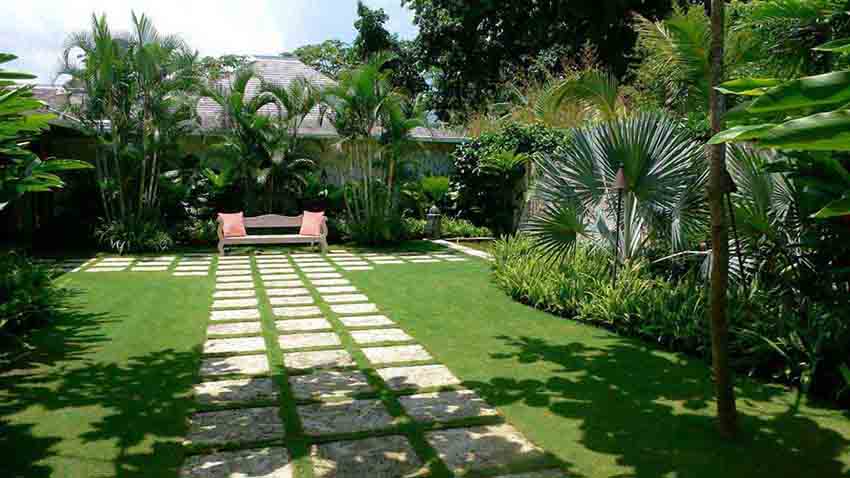
One of the key attributes of any garden, including having a landscape design, is its main view, or to be more accurate, its best view. This is seen when someone is standing in a specific part of the garden and has a better view than they would have if they were standing anywhere else. This is the view you would photograph and make the centrepiece of any photo montage accepted for publication in gardening magazines.
Adding Depth
One of our many landscape design techniques is to create depth, even within relatively small gardens. This can be achieved in several ways, and the two most common are the use of colours and textures. For textures, whether on features like pathways and walls or with plants, the finer they are, the more depth can be created. With colour, blues, purples, and greens are calmer on the eye, and the effect is to add visual depth.
Beautiful Backdrops
Backdrops often enhance photographs, whether it is a model being photographed or a product. With landscaped gardens, the backdrop could be hedges, walls, or fencing, but in all cases, they must look appealing and tidy, and add to the imagery, not detract from it. If you genuinely wish to have a photo of your landscape published, ensure there are no random items in the background detracting from the view, such as litter, rusty tools, or fallen twigs and leaves.
Theming It
Clients often ask us to create landscaping that has a theme, and this is where we can design a garden that is ideal for photography. Whether it be a Mediterranean theme or a Japanese garden, an extremely ornamental garden, or the focus is on water features, in all instances, they are gardens that will catch the eye if photographs of them are published, especially the eyes of those who are also thinking about a similar themed landscape design.
Inanimate Features Are Key
Whilst much of the focus of landscape designs will be on the numerous plants to be included, we also have to think carefully about what features will enhance that landscaping. These include ornaments, water features, seating areas, patios, walkways, etc. Each has its part to play in creating the wonderful aesthetics of the finished landscaped garden and therefore make picture-perfect photographs even more suitable for showcasing it.


